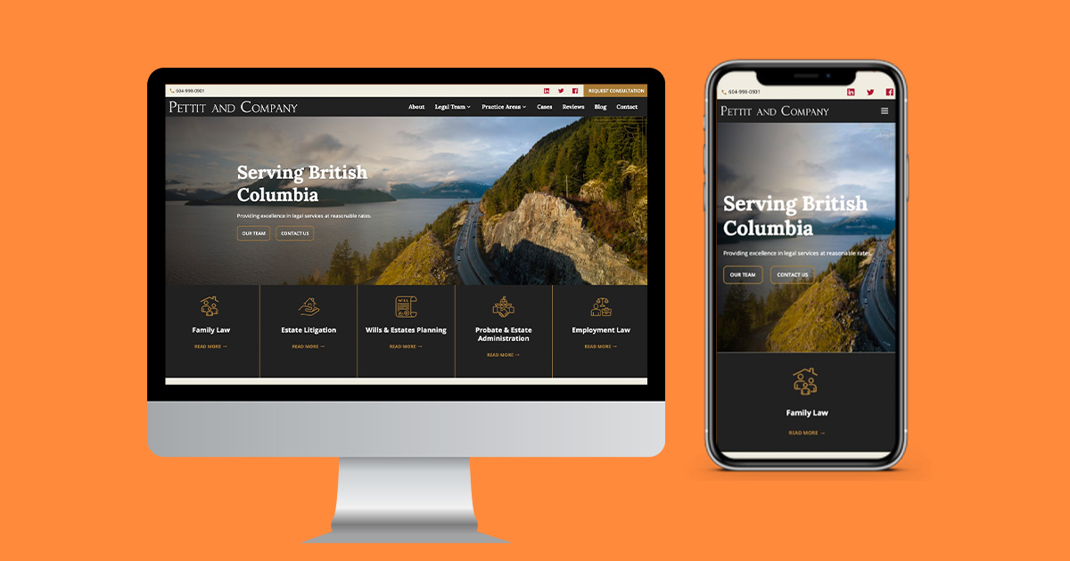

You’ve probably heard the term “mobile-friendly” thrown around when it comes to websites. And while it’s a great start, in 2024, it’s not enough. What your small business really needs is a mobile-first website — and yes, there’s a big difference.
Here’s why:
📱 1. Most of Your Customers Are on Mobile
In South Africa, more than 70% of internet traffic comes from mobile devices. That means your customers are most likely viewing your website on a phone — not a desktop. A mobile-first design starts with the mobile experience as the top priority, not just an afterthought.
🚫 2. Mobile-Friendly Isn’t Always User-Friendly
A mobile-friendly site simply shrinks your desktop layout to fit a smaller screen. But buttons might be too small, text might be hard to read, and navigation may feel clunky. A mobile-first site is designed from the ground up to feel natural and effortless on mobile.
⚡ 3. Speed is Everything on Mobile
Mobile-first websites are lighter, faster, and more focused. That means they load quickly — even on slower mobile data connections — which keeps visitors engaged and reduces bounce rates.
🎯 4. It Improves Conversions
When your website is built for the device your audience is using, they’re far more likely to take action — whether that’s submitting a form, making a call, or purchasing a product. Mobile-first designs make CTAs easier to find and interact with.
🔍 5. Google Loves Mobile-First Sites
Google now prioritizes mobile-first indexing, meaning it ranks websites based on how they perform on mobile. If your site isn’t mobile-first, it could be hurting your SEO and limiting your visibility.
✅ Final Thought:
Having a website is important — but having one that actually works for your mobile audience is essential. A mobile-first website puts your customers first, improves user experience, and helps your business stay competitive online.
Need help upgrading your site?
At Clickatech, we specialize in building modern, mobile-first websites that help small businesses grow online with confidence.